Hi,
Has anyone used GoJS to build diagrams like those shown in Excel as Radar charts and Bubble charts? If so, how difficult was to built them?
Is it at all possible to build those types of diagrams?
Many thanks in advance!
Hi,
Has anyone used GoJS to build diagrams like those shown in Excel as Radar charts and Bubble charts? If so, how difficult was to built them?
Is it at all possible to build those types of diagrams?
Many thanks in advance!
Yes, you can use GoJS to draw almost any kind of chart. It’s not the principal focus of GoJS, so you will need to compute ranges and axes yourself. Although I suppose we could add an extension to make that much easier to do.
You can find examples of charts at:
GoJS Sample Diagrams for JavaScript and HTML, by Northwoods Software
But note especially one named “Charts in Nodes”:
Various Charts in GoJS Nodes
It uses a popular charting library to render the chart, and GoJS just shows that image. You might find it easier to do something similar than to implement what you want from scratch.
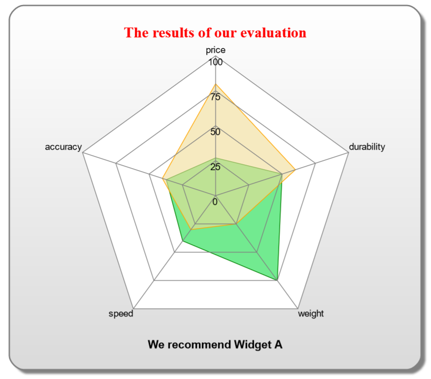
If you do want to build it yourself in GoJS, I would think bubble charts would be relatively easy to implement. Radar charts are more difficult, but we do have an old sample demonstrating them. I’ll see if I can dig it up for you.
OK, I found it and uploaded it to: Radar Chart
As always, the complete source code is there in the page itself.
This one is a bit more complicated than most charts, I would guess.