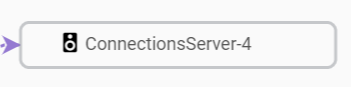
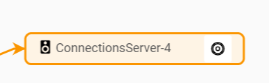
Within my node template I’ve created a horizontal panel containing 2 TextBlocks, with simple text, and a Button. The Button contains a Shape which is an icon and becomes visible when I mouse over the node. Both textblocks are left aligned, margin=1. When the button is not visible, I’m expecting both TextBlocks to appear on the left side of the node, close to the border. Unfortunately, there is too much space between the node edge and the first TextBlock (margin=1). When I mouse over the node the icon appears and now the first TextBlock is close to the border as expected. I do not want the text to move when the button icon becomes visible.
For a “Horizontal” Panel, left and right alignment have no effect. So I cannot explain the effect that you are seeing. It would be useful to show small screenshots and the relevant code.
$(go.Panel, 'Horizontal',
$(go.TextBlock,
{
stroke: '#000', margin: 2,
font: '16px test-fonts, test-fonts',
editable: false,
isMultiline: false,
textAlign: 'left'
}),
$(go.TextBlock, {
margin: 2,
textAlign: 'left',
},
new go.Binding('text', 'name')),
// Button replaces the standard TreeExpanderButton. T
$('Button',
$(go.Shape,
{
name: 'ButtonIcon',
margin: 2,
geometryString: svgIcons.hide,
stretch: go.GraphObject.Fill, // this Shape expands to fill the Button
geometryStretch: go.GraphObject.Uniform,
desiredSize: new go.Size(12, 12),
),
)
You don’t show what the “Horizontal” Panel is in. My guess is that it is centered, and as the “Horizontal” Panel gets wider (because the Picture becomes visible), there is less space on both sides.