Im evaluating the last version of gojs to see if fits out diagram design before buying the library. I need to create the following type of nodes:
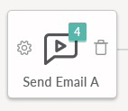
1- Default node:

2- Selected node
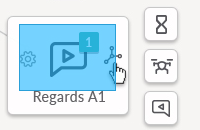
The goal is when the mouse enter the default node is going to show only the name of the node at the bottom, and when it gets clicked/selected is going to show the 2 options images inside the rectangle, and when someone clicks this images is going to show some other icons surrounding the node.
The default node and mouse enter/leave event i got it done without any problem, the selected node step im using selectionAdornmentTemplate creating the same default node with the text on top(mouse enter/leave event don’t get in the way)
Angular code:
selectionAdornmentTemplate: $(go.Adornment, "Spot", $(go.Panel, "Vertical", { background: "#F6F5F3", width: 120, height: 100 }, $(go.Picture, // Pictures should normally have an explicit width and height. // This picture has a red background, only visible when there is no source set // or when the image is partially transparent. { margin: 4, width: 60, height: 60, background: "transparent" }, // Picture.source is data bound to the "source" attribute of the model data new go.Binding("source")), $(go.TextBlock, "Default Text", // the initial value for TextBlock.text, // some room around the text, a larger font, and a white stroke: { name: "nodeName", margin: 6, stroke: "black", font: "bold 12px sans-serif", "editable": true }, // TextBlock.text is data bound to the "name" attribute of the model data new go.Binding("text", "name")) ), $(go.Picture, // Pictures should normally have an explicit width and height. // This picture has a red background, only visible when there is no source set // or when the image is partially transparent. { margin: 10, width: 20, height: 20, alignment: go.Spot.Left }, // Picture.source is data bound to the "source" attribute of the model data new go.Binding("source", "optionIcon")), $(go.Picture, // Pictures should normally have an explicit width and height. // This picture has a red background, only visible when there is no source set // or when the image is partially transparent. { margin: 10, width: 20, height: 20, alignment: go.Spot.Right }, // Picture.source is data bound to the "source" attribute of the model data new go.Binding("source", "linkIcon")) )
Its getting close:
The deal is that the icons Pictures don’t trigger the click event, only when i use the button (GoJS Selection -- Northwoods Software) it triggers the event
Now that i include the important information my questions are:
1- Is this the best approach to accomplish this task? Theres a better one more efficient?, maybe groups?
2- What im doing wrong on the click event not get triggered?
3- How to include the extra icons surrounding the main node on options icon click?
Hope anyone on the gojs team can point me in the right direction, event better the efficient direction.
Thanks