Hey @walter ,
I am working on a component where I am stuck with the Layout part for the design mentioned below:
Specification:
- The L1 group(Yellow) has multiple L2 subgroup (green) and L3 nodes(blue)
- L2 subgroup(green) has multiple L3 nodes(blue).
Constraints:
-
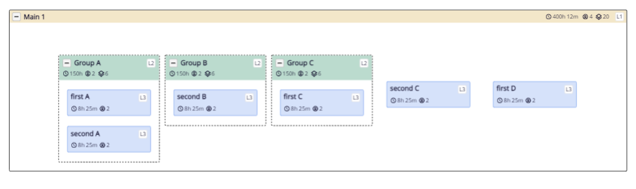
If all L2s are collapsed then they should appear on the left and all the L3 nodes should appear on the right. Like in the image below:
-
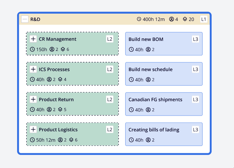
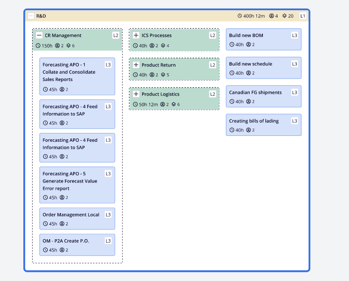
If any of the L2s are expanded then they should appear fully in a column on the left-hand side
-
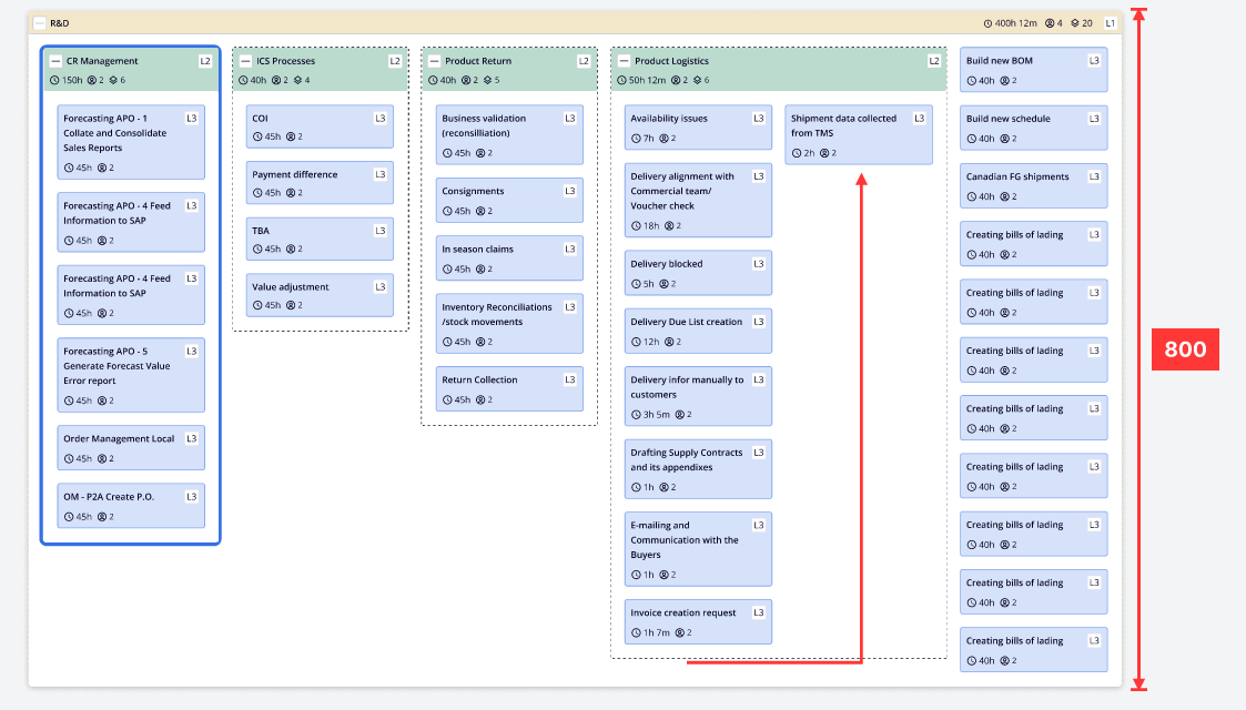
if all the L2’s are expanded then it should look like the below image:
-
If L2s are again collapsed then they should revert back to the previous state as in first point.
-
There is no drag and drop, all the content will be static
I have created 2 group templates(one for L1 and one for L2) and 1 node template(for L3 nodes). I am trying to put some custom layout logic in L1 group layout but couldn’t come up with anything that could satisfy above constraints. Any help would be appreciated.
here is what my sample data looks like:
[
  {
    key: 1,
    isGroup: true,
    category: "OfGroups",
    data: {
      title: "Main 1",
      level: "L1",
    },
    metaData: {
      fillColor: "#F3E7C9",
    },
  },
  {
    key: 3,
    isGroup: true,
    category: "OfNodes",
    group: 1,
    data: {
      title: "Group A",
      level: "L2",
    },
    metaData: {
      fillColor: "#bbdbce",
    },
  },
  {
    key: 4,
    isGroup: true,
    category: "OfNodes",
    group: 1,
    data: {
      title: "Group B",
      level: "L2",
    },
    metaData: {
      fillColor: "#bbdbce",
    },
  },
  {
    key: 5,
    isGroup: true,
    category: "OfNodes",
    group: 1,
    data: {
      title: "Group C",
      level: "L2",
    },
    metaData: {
      fillColor: "#bbdbce",
    },
  },
  {
    key: -7,
    group: 3,
    data: {
      title: "first A",
      level: "L3",
    },
    metaData: {
      fillColor: "#D6E2FA",
    },
  },
  {
    key: -8,
    group: 3,
    data: {
      title: "second A",
      level: "L3",
    },
    metaData: {
      fillColor: "#D6E2FA",
    },
  },
  {
    key: -10,
    group: 4,
    data: {
      title: "second B",
      level: "L3",
    },
    metaData: {
      fillColor: "#D6E2FA",
    },
  },
  {
    key: -12,
    group: 5,
    data: {
      title: "first C",
      level: "L3",
    },
    metaData: {
      fillColor: "#D6E2FA",
    },
  },
  {
    key: -13,
    group: 1,
    data: {
      title: "second C",
      level: "L3",
    },
    metaData: {
      fillColor: "#D6E2FA",
    },
  },
  {
    key: -14,
    group: 1,
    data: {
      title: "first D",
      level: "L3",
    },
    metaData: {
      fillColor: "#D6E2FA",
    },
  }
];
L1 Group template:
$(
      go.Group,
      "Auto",
      {
        isSubGraphExpanded: true,
        ungroupable: true,
        layout: $(go.GridLayout, {   // <-- Put custom Layout Logic here
          wrappingColumn: NaN,
        }),
      },
      $(
        // This Panel is for the bottom layer with transparent background
        go.Shape,
        "RoundedRectangle",
        {
          fill: IconColors.transparent,
          minSize: new go.Size(1200, 70),
          strokeWidth: 1,
          parameter1: 2,
        }
      ),
      $(
        go.Panel,
        "Auto",
        {
          alignment: go.Spot.Top,
        },
        $(
          // This Panel is for the top L1 layer
          go.Shape,
          "RoundedTopRectangle",
          {
            desiredSize: new go.Size(1200, 24),
            strokeWidth: 0,
            parameter1: 2,
          },
          new go.Binding("fill", "metaData", (metaData) => metaData.fillColor)
        ),
        $(
          // Left Side Button and text
          go.Panel,
          "Horizontal",
          {
            alignment: go.Spot.Left,
            margin: new go.Margin(4, 4, 4, 4),
          },
          // Button for expansion & collapse of the Group
          $("SubGraphExpanderButton", {
            alignment: go.Spot.Left,
            margin: new go.Margin(0, 6, 0, 0),
          }), // this Panel acts as a Button
          $(
            // This textBlock contains the title for the node
            go.TextBlock,
            {
              font: ProcessGroupFonts.Title,
              stroke: IconColors.blackPanther,
              margin: new go.Margin(1, 0, 0, 0),
            },
            new go.Binding("text", "data", function (data) {
              return data.title;
            })
          )
        ),

        // #region top right data for effort, user, toil & processes.
        $(
          go.Panel,
          "Horizontal",
          {
            stretch: go.GraphObject.Fill,
            alignment: go.Spot.Right,
          },

          // #region contains the L1, L2, L3 stamps to be shown on the right side of the node
          $(
            go.Panel,
            "Auto",
            {
              margin: new go.Margin(4, 4, 4, 12),
              alignment: go.Spot.TopRight,
            },
            $(
              // This Panel is the background/container for the L1, L2, L3 stamps
              go.Shape,
              "RoundedRectangle",
              {
                fill: IconColors.porcelain,
                strokeWidth: 1,
                stroke: IconColors.grey10,
                parameter1: 2,
                height: 16,
                width: 16,
              }
            ),
            $(
              // This Panel is the text for the L1, L2, L3 stamp
              go.TextBlock,
              {
                font: ProcessGroupFonts.LevelStamp,
                stroke: IconColors.blackPanther,
                height: 15,
                textAlign: "center",
                verticalAlignment: go.Spot.Center,
                spacingAbove: 1,
              },
              new go.Binding("text", "data", function (data) {
                return data.level;
              })
            )
          )
          // #endregion
        )
        // #endregion
      ),
      $(
        go.Placeholder, // represents area for all member parts
        {
          margin: new go.Margin(defaultSize.height, 0, 0, 0),
          padding: new go.Margin(16, 0, 16, 0),
          background: IconColors.transparent,
        }
      )
    );
Here is what currently it looks as per my code: