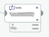
I have a node on the canvas for which I can assign certain configuration. Once I set the configuration for my node, I should be able to display the config in a text box below the node. This text box should be expandable/collapsible.
Please see this image for reference:
I need to toggle expand/collapse on click of the chevron icon on the node.
Is this possible to do? Could you please provide a sample?
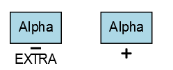
Yes. Implement the details panel as you like, give it a name, and add a “PanelExpanderButton” in the main panel that controls the new panel’s visibility. Examples are in IVR Tree and Entity Relationship.
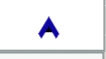
I made use of the panel expander buttons, and functionally they are working fine. But the button is showing up as a tiny black triangle. I want to be able to give my custom icon in place of this. How can i do that? while retaining the rotating functionality of the icon as well?
I think not setting e.handled = true is a bug in our click event handler. Thanks for pointing it out – we will fix this in our next release. In the meantime you can copy the click handler from the extensions/buttons.js file and add that line just before it starts a transaction.
I will look into the persistent triangle later today.
I also used this node template to test that fixing the “PanelExpanderButton”'s click event handler to set e.handled = true does in fact work, so that clicking the button does not also show an alert. This fix has been checked in and will be available in 2.0.18.