Hi,
I have replaced the data in the Genogram sample with some of my own which is only slightly more complicated and have a couple of problems with the layout,
This is my code,
http://foodfortheflock.org.allium.arvixe.com/gen1.html
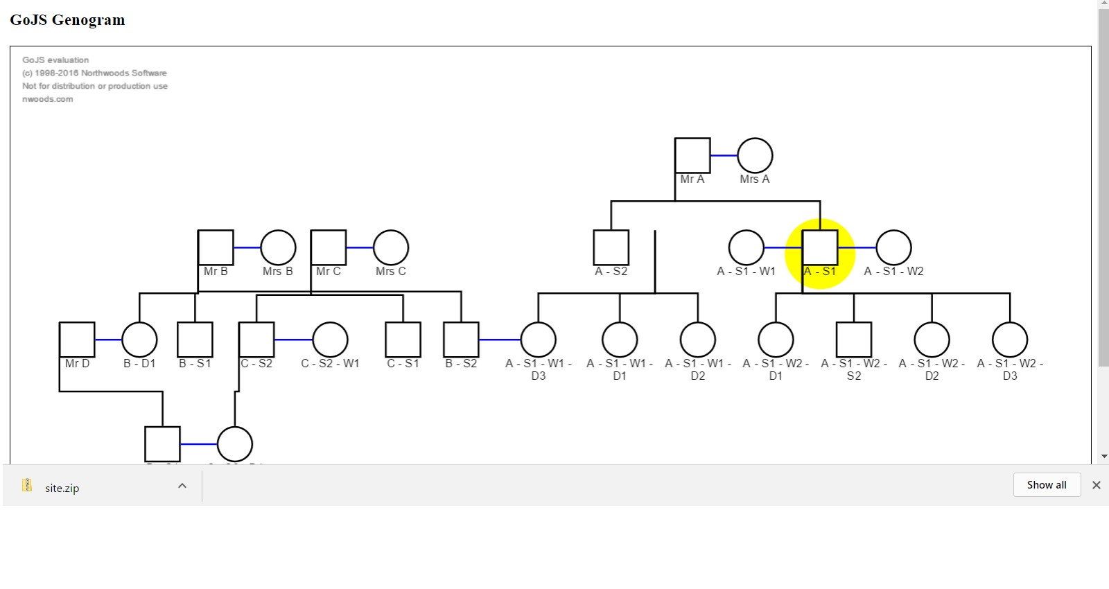
which looks like this,
Firstly on the right hand side of the diagram, the link lines overlap so making the tree unclear. This can be easily solved by adding some width to the line below, here i have added an arbitrary 100
vertex.width = 100+ spouseA.actualBounds.width + this.spouseSpacing + spouseB.actualBounds.width;
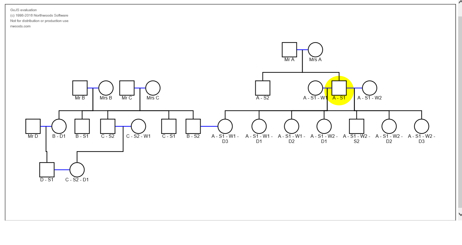
and the result is:
which solves the problem but it has done it by making the widths larger but zooming out on the diagram as a whole, whereas i would like it to have the diagram same size but a scrollbar appear to scroll it left to right as happens on the simple family tree demo, but although have tried different methods and setting large widths on the myDiagramDiv etc, i can’t seem to achieve this?
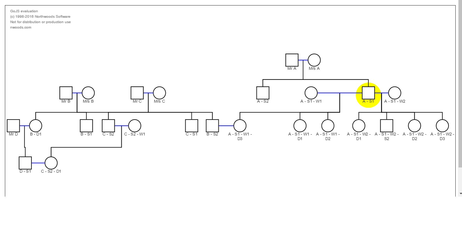
Second question; on the left hand side of the diagram over lapping lines again make it ambiguous … it could be drawn much better like this ( i rearranged the nodes my hand)

i tried rearranging the input data but it always draws it the same, so is there any way to give it hints on how to optimally layout the tree when done dynamically?
failing this, is there a way to at least stop the lines overlapping so the tree can be read simply,
e.g. this would suffice (i just lifted the two nodes and it s now clear despite the crossing).
i cant put a fourth image in, but lifting nodes Mr B and Mrs B makes it clear.
Thanks a lot for any help or suggestions.