Hello,
I am currently working on a project using GoJS version 2.3.12 along with gojs-react version 1.1.2.
I am trying to design a node using the PanelExpanderButton, and I would appreciate your guidance on how to modify the code to achieve the desired functionality.
Below is a sample based on the minimal example:
  const roundedRectangleParams = {
    parameter1: 2, // set the rounded corner
    spot1: go.Spot.TopLeft,
    spot2: go.Spot.BottomRight // make content
  };


  myDiagram.nodeTemplate = $(
    go.Node,
    "Auto",
    {
      resizable: true,
      locationSpot: go.Spot.Top,
      shadowVisible: true,
      shadowBlur: 1,
      shadowOffset: new go.Point(0, 1),
      shadowColor: 'rgba(0, 0, 0, .14)',
      selectionAdornmentTemplate: new go.Adornment('Auto')
      .add(
        new go.Shape('RoundedRectangle', { fill: null, stroke: '#7986cb', strokeWidth: 3 }).set(roundedRectangleParams),
        new go.Placeholder()
      ) // end Adornment
    },
    new go.Binding("desiredSize", "size", go.Size.parse, go.Size.stringify),
    // node background
    $(go.Shape, "RoundedRectangle",
    { name: 'SHAPE', fill: 'white', strokeWidth: 5, stroke: "gray",
    }
    ).set(roundedRectangleParams),

    // inner contents
    $(go.Panel, "Vertical",
      $(go.Panel, "Auto",
        $(go.Shape, "RoundedRectangle",
          {
            fill: "red",
            stroke: null,
          },
          new go.Binding("desiredSize", "size", go.Size.parse, go.Size.stringify)
        ),
        $(go.Panel, "Horizontal", {margin: 8},
          $(go.TextBlock, {
            editable: true,
            overflow: go.TextBlock.OverflowEllipsis,
            font: 'bold 14px sans-serif',
            text: "node name",
            alignment: go.Spot.Left,
            },
            new go.Binding("text", "text")
          ),
          $("PanelExpanderButton", {
            background: "#FFFFFF",
            alignment: go.Spot.Right,
            },"COLLAPSIBLE"
          )
        ),
      ),

      // only visible when info is expanded
      $(go.Panel, "Vertical", {
          name: "COLLAPSIBLE",
          margin: 8,
          defaultAlignment: go.Spot.Left,
          visible: false,
          height: 100
        },
        $(go.TextBlock, {
          text: "additional information 1",
        }),
        $(go.TextBlock, {
            text: "additional information 2",
        })
      )
    )
  )

  myDiagram.model = new go.GraphLinksModel(
    [
      { key: 1, text: 'Alpha', color: "rgba(2, 128, 128, 1)", size: "(150, 50)", bShowInferMon: false},
      { key: 2, text: 'Beta', color: "rgba(2, 128, 128, 1)", size: "(150, 50)", bShowInferMon: false},
      { key: 3, text: 'Gamma', color: "rgba(2, 128, 128, 1)", size: "(150, 50)" , bShowInferMon: false},
      { key: 4, text: 'Delta', color: "rgba(2, 128, 128, 1)", size: "(150, 50)", bShowInferMon: false }
    ],
    [
      { from: 1, to: 2 },
      { from: 1, to: 3 },
      { from: 2, to: 2 },
      { from: 3, to: 4 },
      { from: 4, to: 1 }
    ]
  );
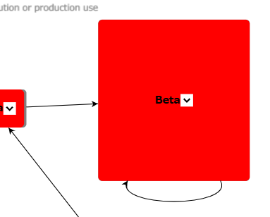
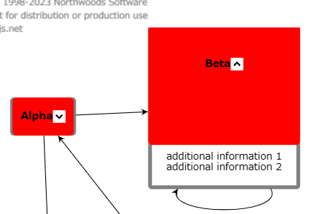
The actual behavior is demonstrated in the following screenshots:
Figure 1: Before pressing the PanelExpanderButton

Figure 2: After pressing the PanelExpanderButton

-
Adjusting the Size of the Red Rectangle Area
I want the panel to appear at the bottom of the node when the PanelExpanderButton is pressed. However, the top area of the panel is being resized awkwardly, causing the text to be misaligned. Can you help me correct this so that when the PanelExpanderButton is pressed, the size of the top panel is adjusted appropriately and the TextBlock is centered in that panel? -
Border Visibility
Currently, the gray border is hidden behind the red panel. Is it possible to bring this border to the front? Alternatively, can I adjust the width and height of the internal red panel to account for the border’s width?
Thank you in advance for your assistance.