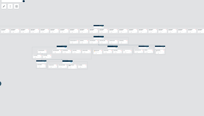
Hi there, we are currently exploring possibilities for rendering very large org charts.
When there are a lot of nodes with no parents or one parent contains a lot of children the diagram becomes hard to use because it blows up horizontally which requires a lot of scrolling to navigate.
We’ve played with the breadthLimit API which has been useful but doesn’t quite seem to fix the problem entirely. (It also doesn’t apply to root nodes)
Are there any good examples or ideas to make the user experience sufficiently enjoyable for large tree diagrams? (Some nodes may have 200 children and some may only have 0/1 children)
