In the GOXAM version trying to show a listbox with vertical orientation by using the Items panel does not work. This did however work in the Silverlight version. How can we accomplish this? Here is the code that is in the NodePanel
Frank
walter
March 13, 2020, 2:09am
2
Several of the samples in GoWpfDemo have ListBox es in Node templates. What was the code in Silverlight?
In general you can implement whatever XAML you like in each Node template or Link template.
I put the code in the prior message, in Silverlight it would show up Horizontal but in the WPF version it shows vertical. If nothing in Goxam is stopping this behavior I would have to look elsewhere. I just need to be shure that the problem is not in the Goxam library.
Regards,
I Also tried a componentone listbox but this does not show anything whereas the normal list box shows the data but I can not get this to show horizontal
Frank
walter
March 13, 2020, 2:44pm
5
The code above refers to the “wpf” namespace, so I assumed this code was for WPF, not for Silverlight.
OK, I don’t know of any problems like what you refer to. It’s certainly the case that the controls operate slightly differently between WPF and Silverlight, so I’m not surprised that the appearances of the nodes are different. In fact you can see that we subclassed both ListBox and ListBoxItem in the Dynamic Ports sample because we did not like the standard behavior.
walter
March 13, 2020, 2:46pm
6
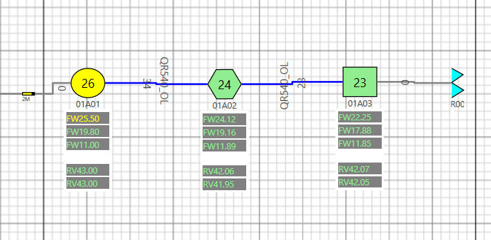
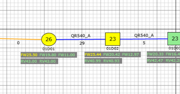
(crossing posts)ListBox es that are horizontal as well as two that are vertical.
Hi Walter,
This is the code, the prior message had a wrappanel since I was trying to see if that worked.
This is how it shows in WPF
walter
March 13, 2020, 3:06pm
9
OK. What is the problem? Perhaps the separator?
I suggest that you try implementing as much as you can of your node template outside of any Diagram, just to make sure it works the way that you want before you put it into your node template.
Hi Walter,
This is how it shows in Silverlight
I simplified everything and also showed gridlines etc to debug, the items panel works in a normal WPF page but when I Add it to the diagram I still can not get it to show vertical
                <Grid ShowGridLines="True">
                    <Grid.RowDefinitions>
                        <RowDefinition />
                        <RowDefinition />
                        <RowDefinition />
                        <RowDefinition />
                        <RowDefinition />
                    </Grid.RowDefinitions>

                    <Grid.ColumnDefinitions>
                        <ColumnDefinition Width="Auto"/>
                        <!--<ColumnDefinition MaxWidth="{Binding Path=Data.Width}" />-->
                        <ColumnDefinition Width="Auto"/>
                        <ColumnDefinition Width="Auto"/>

                    </Grid.ColumnDefinitions>
                    <TextBlock Text="Col0" Grid.Row="1" Grid.Column="0"/>
                    <TextBlock Text="Col1" Grid.Row="1" Grid.Column="1"/>
                    <TextBlock Text="Col2" Grid.Row="1" Grid.Column="2"/>

                        <ListBox  x:Name="TapPoortFLevel" Grid.Row="3" Grid.Column="0" Grid.ColumnSpan="3" Visibility="Visible"
                              Width="Auto" HorizontalAlignment="Left" BorderThickness="0" Background="Transparent"
                             ScrollViewer.HorizontalScrollBarVisibility="Disabled" ScrollViewer.VerticalScrollBarVisibility="Disabled" >
                        <ListBoxItem Content="Test1"></ListBoxItem>
                        <ListBoxItem Content="Test2"></ListBoxItem>
                        <ListBox.ItemContainerStyle>
                            <Style TargetType="ListBoxItem">
                                <Setter Property="Margin" Value="0" />
                                <Setter Property="Padding" Value="0,0,0,0"/>
                            </Style>
                        </ListBox.ItemContainerStyle>
                        <ListBox.ItemsPanel>
                            <ItemsPanelTemplate>
                                <StackPanel Orientation="Horizontal" />
                            </ItemsPanelTemplate>
                        </ListBox.ItemsPanel>
                    </ListBox>

                </Grid>

        </StackPanel>
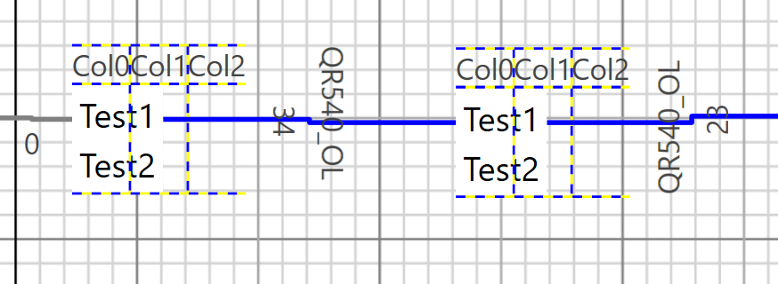
This is what it shows:
Frank
walter
March 14, 2020, 11:34am
11
Maybe the problem is that the panel(s) containing your Grid Panel are limiting its total width.
I tested that also with a long string and that displays fine.
walter
March 14, 2020, 7:41pm
13
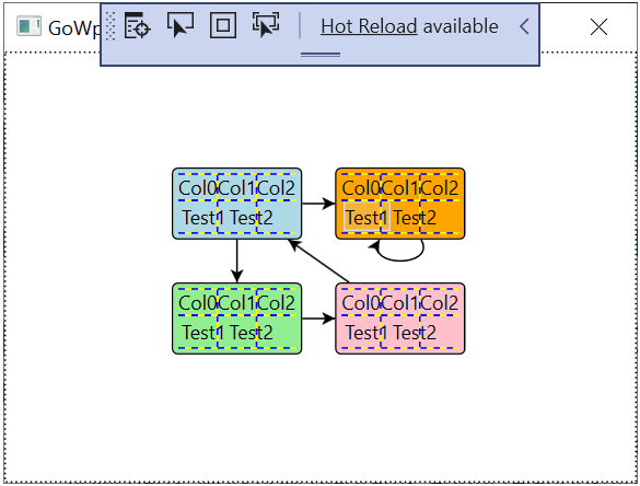
I just modified the GoWpfMinimal app by changing the Node template to include your XAML. The result is:
Isn’t this what you would expect?
Yes, How did you do that?
walter
March 14, 2020, 7:43pm
15
The only file I changed was MainWindow.xaml:
<Window x:Class="Minimal.MainWindow"
        xmlns="http://schemas.microsoft.com/winfx/2006/xaml/presentation"
        xmlns:x="http://schemas.microsoft.com/winfx/2006/xaml"
        xmlns:d="http://schemas.microsoft.com/expression/blend/2008"
        xmlns:mc="http://schemas.openxmlformats.org/markup-compatibility/2006"
        xmlns:go="http://schemas.nwoods.com/GoXam"
        mc:Ignorable="d"
        Title="GoWpf Minimal" Width="400" Height="300">
  <FrameworkElement.Resources>
    <DataTemplate x:Key="MyNodeTemplate">
      <Border BorderBrush="Black" BorderThickness="1"
              Padding="3" CornerRadius="3"
              Background="{Binding Path=Data.Color}"
              go:Part.SelectionAdorned="True"
              go:Node.Location="{Binding Path=Data.Location, Mode=TwoWay}">
        <!--<TextBlock Text="{Binding Path=Data.Key}" />-->

        <Grid ShowGridLines="True">
          <Grid.RowDefinitions>
            <RowDefinition />
            <RowDefinition />
            <RowDefinition />
            <RowDefinition />
            <RowDefinition />
          </Grid.RowDefinitions>

          <Grid.ColumnDefinitions>
            <ColumnDefinition Width="Auto"/>
            <!--<ColumnDefinition MaxWidth="{Binding Path=Data.Width}" />-->
            <ColumnDefinition Width="Auto"/>
            <ColumnDefinition Width="Auto"/>

          </Grid.ColumnDefinitions>
          <TextBlock Text="Col0" Grid.Row="1" Grid.Column="0"/>
          <TextBlock Text="Col1" Grid.Row="1" Grid.Column="1"/>
          <TextBlock Text="Col2" Grid.Row="1" Grid.Column="2"/>

          <ListBox  x:Name="TapPoortFLevel" Grid.Row="3" Grid.Column="0" Grid.ColumnSpan="3" Visibility="Visible"
                              Width="Auto" HorizontalAlignment="Left" BorderThickness="0" Background="Transparent"
                             ScrollViewer.HorizontalScrollBarVisibility="Disabled" ScrollViewer.VerticalScrollBarVisibility="Disabled" >
            <ListBoxItem Content="Test1"></ListBoxItem>
            <ListBoxItem Content="Test2"></ListBoxItem>
            <ListBox.ItemContainerStyle>
              <Style TargetType="ListBoxItem">
                <Setter Property="Margin" Value="0" />
                <Setter Property="Padding" Value="0,0,0,0"/>
              </Style>
            </ListBox.ItemContainerStyle>
            <ListBox.ItemsPanel>
              <ItemsPanelTemplate>
                <StackPanel Orientation="Horizontal" />
              </ItemsPanelTemplate>
            </ListBox.ItemsPanel>
          </ListBox>

        </Grid>

      </Border>
    </DataTemplate>
  </FrameworkElement.Resources>
  <Grid>
    <go:Diagram x:Name="myDiagram"
                Padding="10"
                HorizontalContentAlignment="Stretch"
                VerticalContentAlignment="Stretch"
                NodeTemplate="{StaticResource MyNodeTemplate}">
    </go:Diagram>
  </Grid>
</Window>
Ok, I am going to test. Will let you know