Morning Walter, hope you had a great weekend!
The actual item lists have a Flow layout panel, the position panel is wrapping the flow panel. This was done to test if the Flow panels being direct siblings were the cause. The content panel of the card itself is a vertical panel to handle stacking them vertically.
I’ll try a little more verbose to show the properties in use by each and how the template is composed. Note that the XyzConfig objects represent the defaults for the node/panel data objects.
PillsList
const PillsListConfig = {
  'pills.items': [],
  'pills.visible': false,
}

class PillsList {
  constructor(key = 'pills') {
    const pills = new go.Panel(go.Panel.Flow, {
      itemArray: PillsListConfig['pills.items'],
      itemTemplate: new PillsListItem(),
      name: `PillsListItems.${key}`,
      spacing: new go.Size(2, 0),
      stretch: go.Stretch.Horizontal,
    });

    pills.bind('itemArray', `${key}.items`);
    return pills;
  }
}
PillsListItem
const PillsListItemConfig = {
  label: '',
  tooltip: '',
  expanded: false,
  fill: palettes.brand.grey.shades[0],
  stroke: palettes.brand.grey.tints[2],
}

class PillsListItem {
  constructor() {
    const panel = new go.Panel(go.Panel.Auto, {
      name: `Pill`,
    });

    panel.add(this.background());
    panel.add(this.content());
    return panel;
  }

  background() {
    const background = new go.Shape({
      figure: 'Border',
      fill: PillsListItemConfig['fill'],
      name: 'PillBackground',
      parameter1: 4,
      spot1: new go.Spot(0, 0),
      spot2: new go.Spot(1, 1),
      strokeWidth: 0,
    });

    background.bind('fill', 'fill');
    return background;
  }

  content() {
    const content = new go.Panel(go.Panel.Position, {
      minSize: new go.Size(16, 12),
      name: 'PillContent',
    });

    content.add(this.label());
    return content;
  }

  label() {
    const label = new go.TextBlock({
      font: '600 10px Poppins, sans-serif',
      margin: new go.Margin(0, 4),
      name: 'PillText',
      spacingAbove: 2,
      spacingBelow: 2,
      textAlign: 'center',
      visible: false,
      stroke: PillsListItemConfig['stroke'],
      text: PillsListItemConfig['label'],
    });

    label.bind('stroke', 'stroke');
    label.bind('text', 'label');
    label.bind('visible', 'expanded');
    return label;
  }
}
CardTemplate
export default class CardTemplate {
  constructor() {
    const template = new go.Group(go.Panel.Spot, {
      computesBoundsAfterDrag: true,
      computesBoundsIncludingLocation: true,
      isSubGraphExpanded: CardTemplateConfig['card.items.expanded'],
      isTreeExpanded: CardTemplateConfig['tree.expanded'],
      layout: new go.GridLayout({ ... }),
      name: 'CardEntity',
      selectionAdorned: false,
      zOrder: 20,
    });

    const body = new CardBody();
    // ...
    body.slots.content.add(this.tags());
    body.slots.content.add(this.properties());
    // ...
    template.add(body);

    template.bind('isSubGraphExpanded', 'card.items.expanded');
    template.bind('isTreeExpanded', 'tree.expanded');
    return template;
  }

  // ...

 properties() {
    return new PillsList('properties', {
      margin: new go.Margin(0, 8, 4, 8),
    });
  }

  tags() {
    return new PillsList('tags', {
      margin: new go.Margin(0, 8, 4, 8),
    });
  }

  // ...
}
CardBody
Abridged, mainly just to show the panel and how the “slots” work. They’re custom defined property on the template class only used for composition. Once .copy/Template is called downstream, it’s removed.
class CardBody {
  constructor() {
    const body = new go.Panel(go.Panel.Position, {
      cursor: 'grab',
      name: 'Card',
    });

    body.slots = {};
    // ...
    body.slots.content = this.content();
    // ...

    return body;
  }

  content() {
    const content = new go.Panel(go.Panel.Vertical, {
      name: 'Content',
      width: CardBodyConfig['card.body.width'],
    });

    content.bind('width', 'card.body.width');
    return content;
  }
}
NodeData
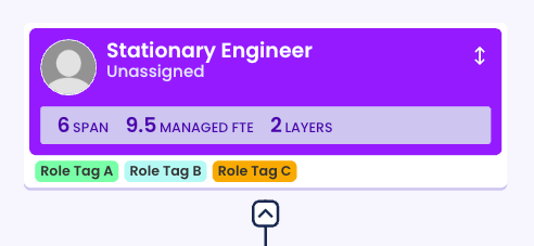
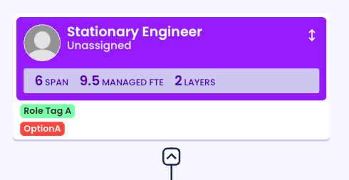
Relevant node data for the given example role card in the OP.
{
    "key": "<ROLE_ID>",
    // ...
    "properties.items": [
        {
            "key": "CHsk2sYFoLWJSUtDKorGQ:CHuQiyavgcRcM53BXgK3P",
            "label": "OptionA",
            "tooltip": "RoleDropdownProperty: OptionA",
            "fill": "#FF3838",
            "stroke": "#FAFAFA",
            "expanded": true
        }
    ],
    "properties.visible": true,
    "tags.items": [
        {
            "key": "<ROLE_ID>:<TAG_ID_A>",
            "label": "Role Tag A",
            "tooltip": "Role Tag A",
            "fill": "#85FCB1",
            "stroke": "#333333",
            "expanded": true
        },
        {
            "key": "<ROLE_ID>:<TAG_ID_B>",
            "label": "Role Tag B",
            "tooltip": "Role Tag B",
            "fill": "#B4FAF5",
            "stroke": "#333333",
            "expanded": true
        },
        {
            "key": "<ROLE_ID>:<TAG_ID_C>",
            "label": "Role Tag C",
            "tooltip": "Role Tag C",
            "fill": "#FF9F1A",
            "stroke": "#333333",
            "expanded": true
        }
    ],
    "tags.visible": true,
    // ...
}
So I’ve tested setting the properties.visible to false, and again all 3 role tags showed up. So it’s only while both those PillsList are visible that they start to become affected.
I also tested the possibility of the pills overlapping each other by setting the PillsListItem, opacity to quite low, but there’s only the card background behind them.
Hopefully this helps give more context.
Thanks,
James